Multidimensional whole genome synteny: Difference between revisions
Created page with 'A popular means to compare whole genomes is the use of Syntenic dotplots. These dotplots reveal regions of the genomes that are related through common ancestry -- either thro...' |
No edit summary |
||
| (4 intermediate revisions by the same user not shown) | |||
| Line 3: | Line 3: | ||
{| width="800" border="1" cellpadding="1" cellspacing="1" | {| width="800" border="1" cellpadding="1" cellspacing="1" | ||
|- | |- | ||
| | | [[File:Screen Shot 2013-09-04 at 10.40.50 AM.png|thumb|400px]] | ||
| [[ | | [[File:Screen Shot 2013-09-04 at 10.35.32 AM.png|thumb|400px]] | ||
|- | |- | ||
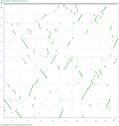
| | | Syntenic dotplot of the maize genome versus the sorghum genome. Dotplot may be regenerated: http://genomevolution.org/r/9cnr]] | ||
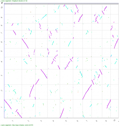
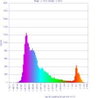
| Syntenic dotplot of the maize genome versus the sorghum genome. Syntenic dots are colored by Ks values which is a proxy for their divergence age. Note that there are two major colors -- purple and cyan. The purple dots reflect younger gene pairs and cyan dots reflect older gene pairs. [[ | | Syntenic dotplot of the maize genome versus the sorghum genome. Syntenic dots are colored by Ks values which is a proxy for their divergence age. Note that there are two major colors -- purple and cyan. The purple dots reflect younger gene pairs and cyan dots reflect older gene pairs. Also note that a given region in one genome has more than one synteny region (set of dots that make a line) in the other genome. Dotplot may be regenerated: http://genomevolution.org/r/9cnj. [[File:Master 16904 93.CDS-CDS.last.tdd10.cs0.filtered.dag.all.go D20 g10 A5.aligncoords.gcoords ct0.w1000.gene.s.ks.sr.cs1.csoN.log.nsd.hist.png|thumb|200px]] | ||
|- | |- | ||
| | | | ||
| | | | ||
|} | |} | ||
While such dotplot visualizations work well for pair-wise comparisons of genomes, this does not scale well for more than two genomes. There is a need to develop new visualizations for multidimensional whole genome comparisons that will enable scientists to easily identify multiple syntneic regions in a given genome as well as syntenic regions of differing age-classes. Importantly, such visualizations need to be dynamic and permit scientists to interact with the data for exploratory analyses. Some possible means to achieve these data representations include dimensionality reduction techniques (e.g., PCA), immersive 3D visualization systems (e.g., [http://rc.arizona.edu/visualization-consulting/sample-visualization-projects UA Visualization Cave]), and data clustering techniques. | |||
Latest revision as of 17:49, 4 September 2013
A popular means to compare whole genomes is the use of Syntenic dotplots. These dotplots reveal regions of the genomes that are related through common ancestry -- either through the divergence of lineages/species or through intra-genomic duplications. CoGe makes the generation of these available through its tool SynMap as well as providing the means to add additional information about the divergence age of syntenic gene pairs to the dots in the dotplot.
 |
 |
| Syntenic dotplot of the maize genome versus the sorghum genome. Dotplot may be regenerated: http://genomevolution.org/r/9cnr]] | Syntenic dotplot of the maize genome versus the sorghum genome. Syntenic dots are colored by Ks values which is a proxy for their divergence age. Note that there are two major colors -- purple and cyan. The purple dots reflect younger gene pairs and cyan dots reflect older gene pairs. Also note that a given region in one genome has more than one synteny region (set of dots that make a line) in the other genome. Dotplot may be regenerated: http://genomevolution.org/r/9cnj.  |
While such dotplot visualizations work well for pair-wise comparisons of genomes, this does not scale well for more than two genomes. There is a need to develop new visualizations for multidimensional whole genome comparisons that will enable scientists to easily identify multiple syntneic regions in a given genome as well as syntenic regions of differing age-classes. Importantly, such visualizations need to be dynamic and permit scientists to interact with the data for exploratory analyses. Some possible means to achieve these data representations include dimensionality reduction techniques (e.g., PCA), immersive 3D visualization systems (e.g., UA Visualization Cave), and data clustering techniques.