Admin Graph Screenshots: Difference between revisions
mNo edit summary |
|||
| (7 intermediate revisions by 2 users not shown) | |||
| Line 1: | Line 1: | ||
Here at CoGe we've been working on an Admin dashboard for the site, a place where CoGe Administrators can get to the tools and information they need to maintain and improve the sight all in one place. The newest addition to this page is the "Graph" tab, which allows us to see a visual representation of our user base and the kind of data it uses. | |||
Using the [https://github.com/mbostock/d3/wiki/Force-Layout D3.js force layout] we are able to see this information in the form of a naturally self-organizing graph. Each node in the first layer of the graph is a user. These nodes can be clicked to reveal their child objects: the notebooks, genomes, and experiments that user maintains on the site. Notebooks themselves can then also be expanded in a similar fashion. The size of each node is relative to the number of child objects it holds, so it is fairly easy to see who the power users are at a glance. The graph is "naturally self-organizing" because of the force calculations that the layout runs on each node and link. A "gravity" value pulls each element towards the center of the screen to keep them form leaving the view. A "charge" value pushes nodes away from each other, and scaling this value off of the node's size allows us to prevent visual overlap between nodes. The balance of these two values causes the graph to stabilize in a state where each node is equally visible, which gives us a great, holistic picture of how our users are using data in CoGe. | |||
This tool is not yet publicly available (because it displays sensitive information about users and their data) but we are working on an "anonymized" version for public use. | |||
== Snapshots of the development process of the Admin dashboard's Graph tab. == | == Snapshots of the development process of the Admin dashboard's Graph tab. == | ||
[[File:Graph_Screen_1.png]] | [[File:Graph_Screen_1.png]] | ||
Adjusting the size and "charge" force of nodes. | Adjusting the size and "charge" force of nodes. | ||
[[File:Graph_Screen_2.png]] | [[File:Graph_Screen_2.png]] | ||
High charge and small size make for visually stunning graphs, but most of the nodes are too small to interact with properly. | High charge and small size make for visually stunning graphs, but most of the nodes are too small to interact with properly. | ||
[[File:Graph_Screen_3.png]] | [[File:Graph_Screen_3.png]] | ||
Even when a node's charge is | |||
Even when a node's charge is calculated using its size, it doesn't seem to scale in a linear fashion. | |||
[[File:Graph_Screen_4.png]] | [[File:Graph_Screen_4.png]] | ||
This is a much cleaner balance. Each node has its own space without the graph as a whole spreading out too much. | This is a much cleaner balance. Each node has its own space without the graph as a whole spreading out too much. | ||
[[File:Graph_Screen_5.png]] | [[File:Graph_Screen_5.png]] | ||
Some of the nodes in the "Groups" subtree. The large white node is the "User" subtree. | Some of the nodes in the "Groups" subtree. The large white node is the "User" subtree. | ||
[[File:Graph_Screen_6.png]] | [[File:Graph_Screen_6.png]] | ||
More open nodes, showing several layers of depth. | More open nodes, showing several layers of depth. | ||
[[File:Graph_Screen_7.png]] | [[File:Graph_Screen_7.png]] | ||
The large red node is a notebook that has a large number of experiments stored inside. | The large red node is a notebook that has a large number of experiments stored inside. | ||
[[File:Graph_Screen_8.png]] | [[File:Graph_Screen_8.png]] | ||
When opened, the | |||
When opened, the notebook appears to hold entirely genomes (green nodes). | |||
[[File:Graph_Screen_9.png]] | [[File:Graph_Screen_9.png]] | ||
Moving some of the nodes around makes the graph clearer. | |||
[[File:Graph_Screen_10.png]] | [[File:Graph_Screen_10.png]] | ||
A graph angel that naturally arises when looking at our two biggest power-users. | A graph angel that naturally arises when looking at our two biggest power-users. | ||
[[File:Graph_Screen_11.png]] | [[File:Graph_Screen_11.png]] | ||
A fully opened look at the group graph. Black nodes are nodes that could have child objects, but don't. | A fully opened look at the group graph. Black nodes are nodes that could have child objects, but don't. | ||
[[File:Graph_Screen_12.png]] | [[File:Graph_Screen_12.png]] | ||
The same graph with a filter applied to show public (green), restricted (grey), and deleted data (yellow). | The same graph with a filter applied to show public (green), restricted (grey), and deleted data (yellow). | ||
Latest revision as of 19:19, 11 June 2015
Here at CoGe we've been working on an Admin dashboard for the site, a place where CoGe Administrators can get to the tools and information they need to maintain and improve the sight all in one place. The newest addition to this page is the "Graph" tab, which allows us to see a visual representation of our user base and the kind of data it uses.
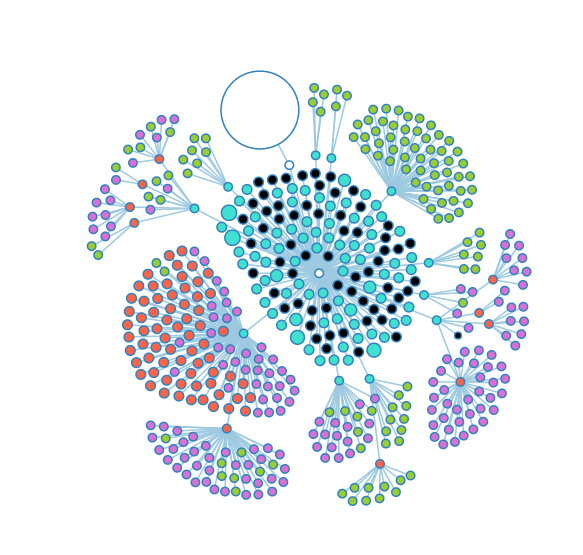
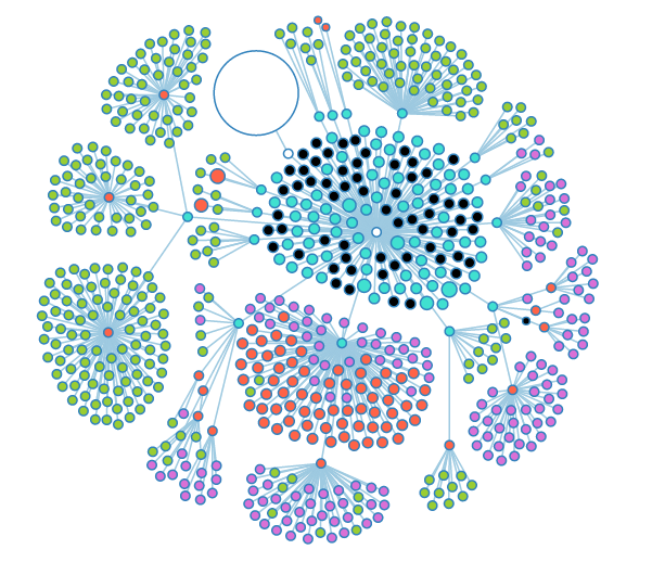
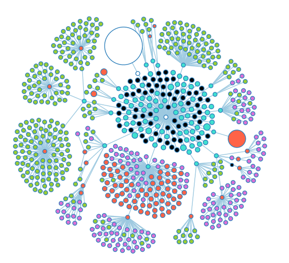
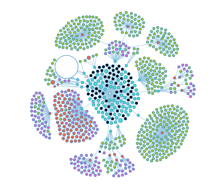
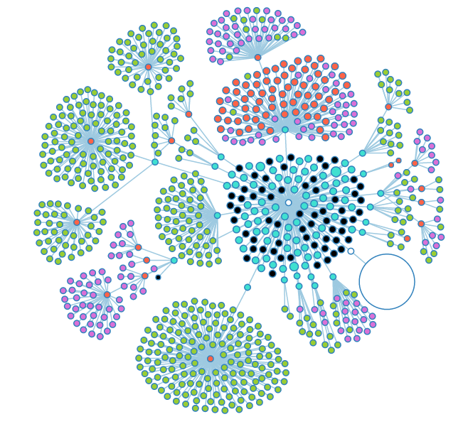
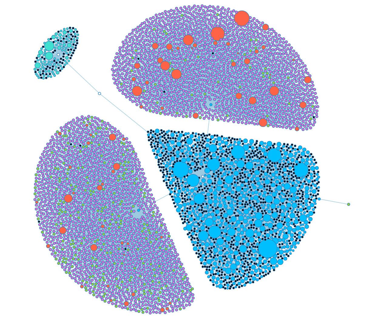
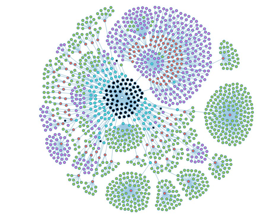
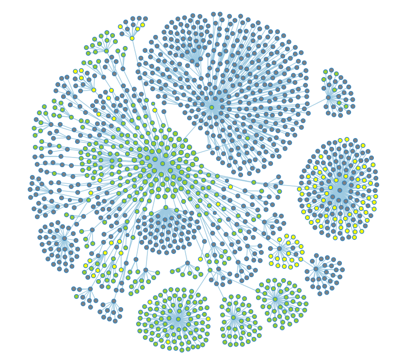
Using the D3.js force layout we are able to see this information in the form of a naturally self-organizing graph. Each node in the first layer of the graph is a user. These nodes can be clicked to reveal their child objects: the notebooks, genomes, and experiments that user maintains on the site. Notebooks themselves can then also be expanded in a similar fashion. The size of each node is relative to the number of child objects it holds, so it is fairly easy to see who the power users are at a glance. The graph is "naturally self-organizing" because of the force calculations that the layout runs on each node and link. A "gravity" value pulls each element towards the center of the screen to keep them form leaving the view. A "charge" value pushes nodes away from each other, and scaling this value off of the node's size allows us to prevent visual overlap between nodes. The balance of these two values causes the graph to stabilize in a state where each node is equally visible, which gives us a great, holistic picture of how our users are using data in CoGe.
This tool is not yet publicly available (because it displays sensitive information about users and their data) but we are working on an "anonymized" version for public use.
Snapshots of the development process of the Admin dashboard's Graph tab.
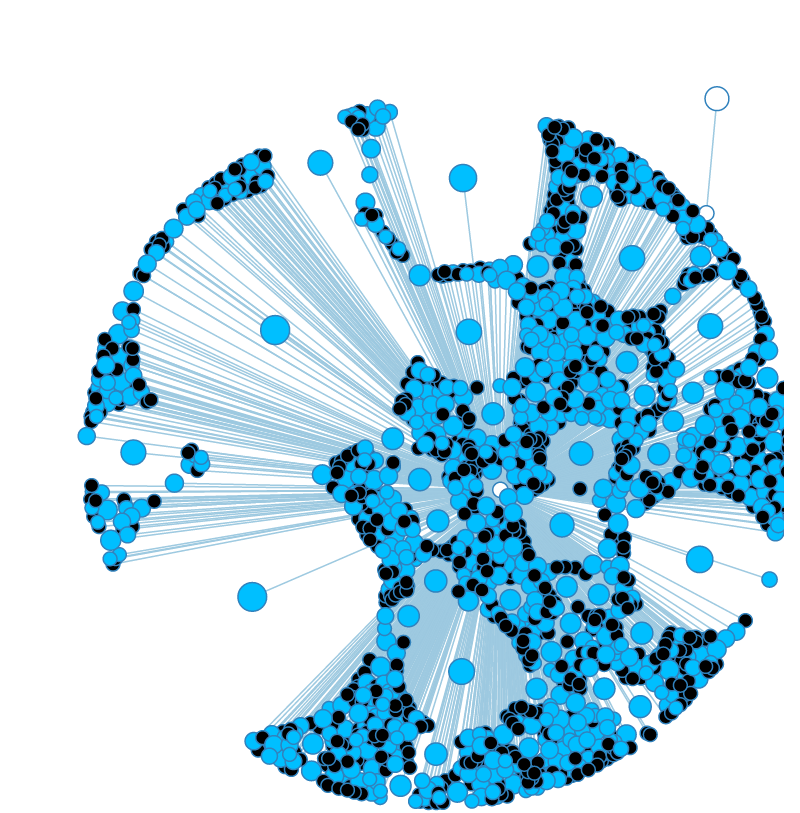
Adjusting the size and "charge" force of nodes.
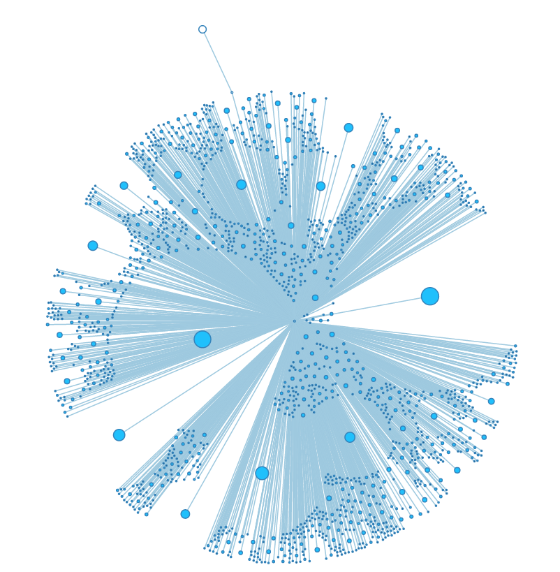
High charge and small size make for visually stunning graphs, but most of the nodes are too small to interact with properly.
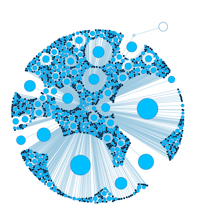
Even when a node's charge is calculated using its size, it doesn't seem to scale in a linear fashion.
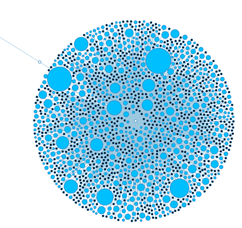
This is a much cleaner balance. Each node has its own space without the graph as a whole spreading out too much.
Some of the nodes in the "Groups" subtree. The large white node is the "User" subtree.
More open nodes, showing several layers of depth.
The large red node is a notebook that has a large number of experiments stored inside.
When opened, the notebook appears to hold entirely genomes (green nodes).
Moving some of the nodes around makes the graph clearer.
A graph angel that naturally arises when looking at our two biggest power-users.
A fully opened look at the group graph. Black nodes are nodes that could have child objects, but don't.
The same graph with a filter applied to show public (green), restricted (grey), and deleted data (yellow).
