Admin Graph Screenshots
Snapshots of the development process of the Admin dashboard's Graph tab.
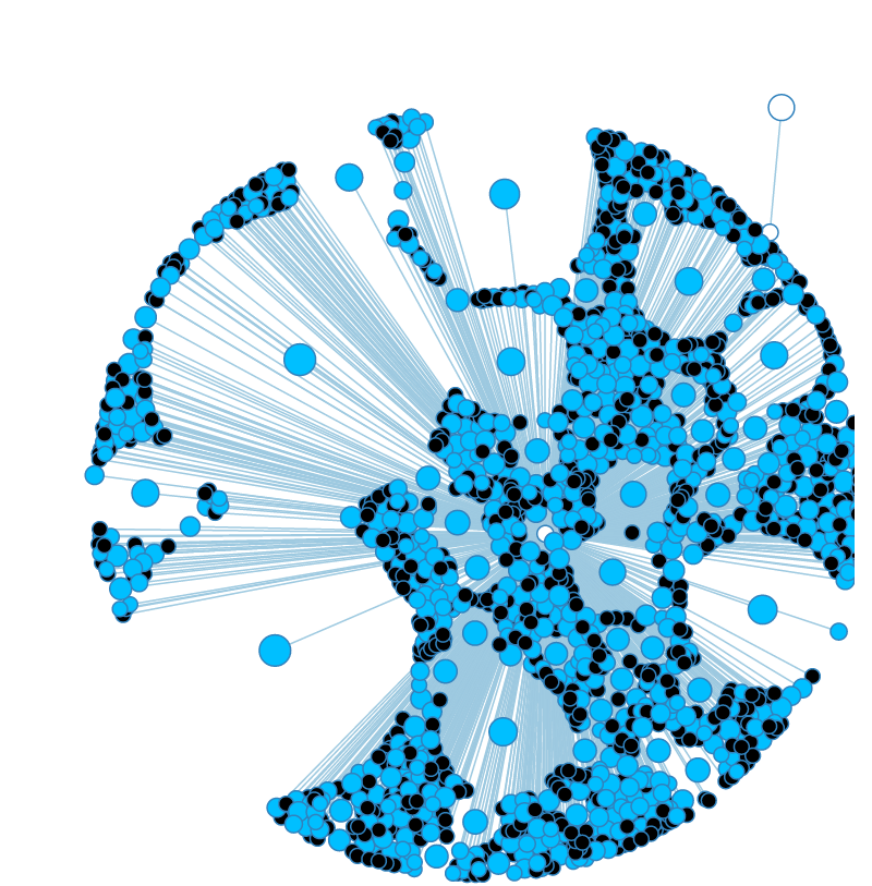 Adjusting the size and "charge" force of nodes.
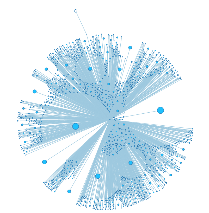 High charge and small size make for visually stunning graphs, but most of the nodes are too small to interact with properly.
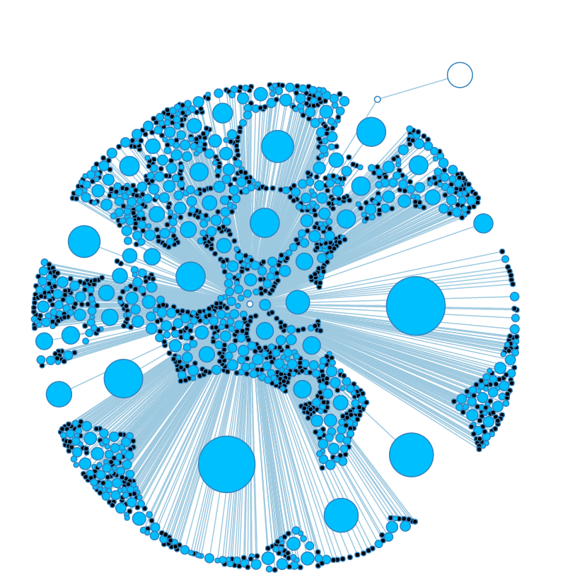 Even when a node's charge is calculating using its size, it doesn't seem to scale in a linear fashion.
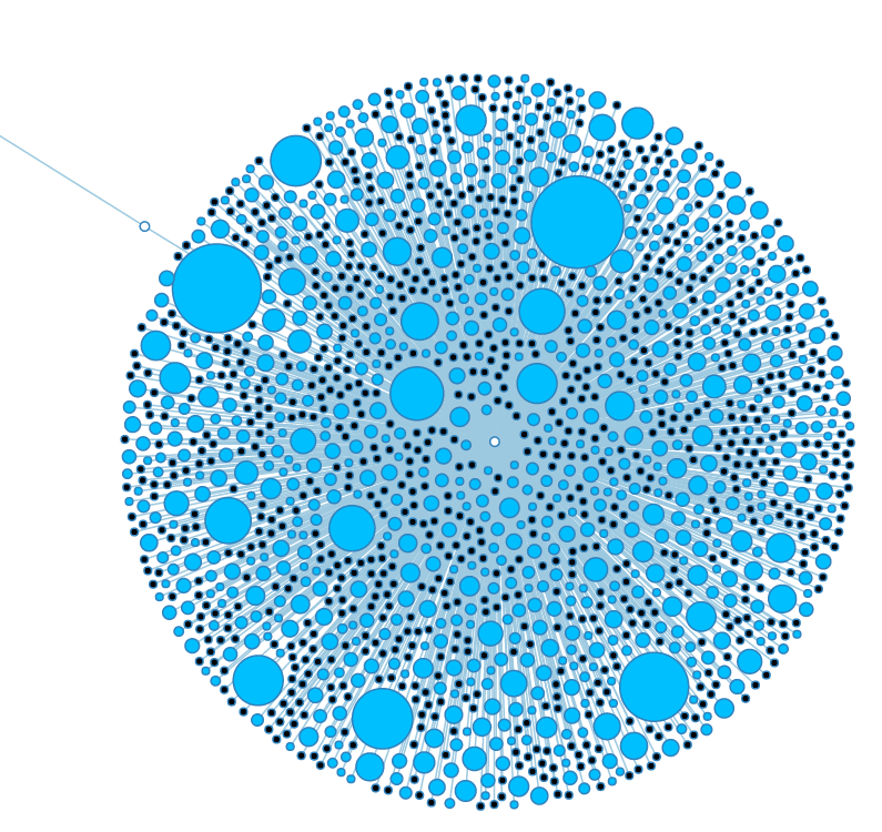 This is a much cleaner balance. Each node has its own space without the graph as a whole spreading out too much.
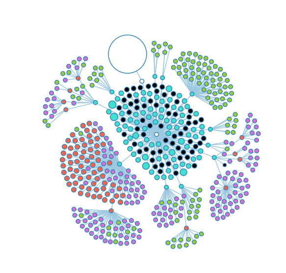 Some of the nodes in the "Groups" subtree. The large white node is the "User" subtree.
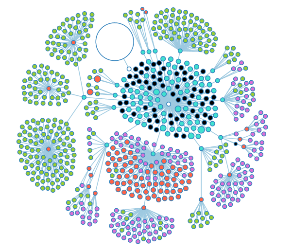 More open nodes, showing several layers of depth.
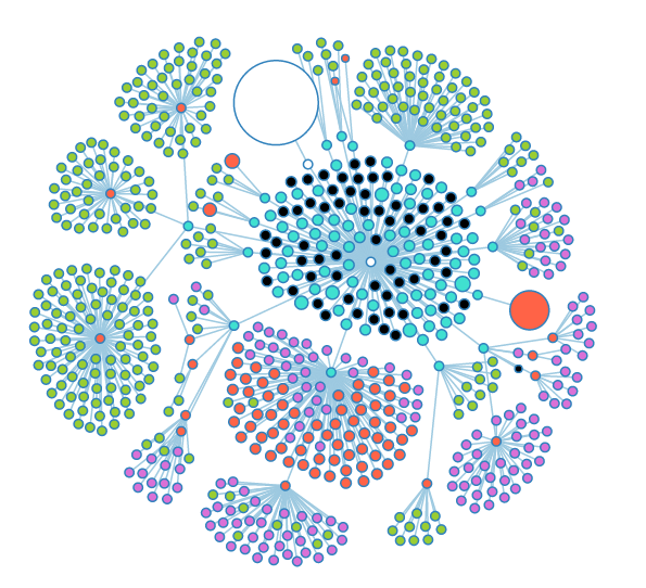 The large red node is a notebook that has a large number of experiments stored inside.
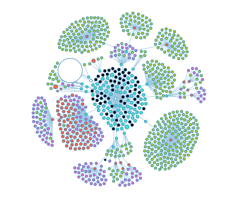 When opened, the red appears to have entirely green child objects (genomes).
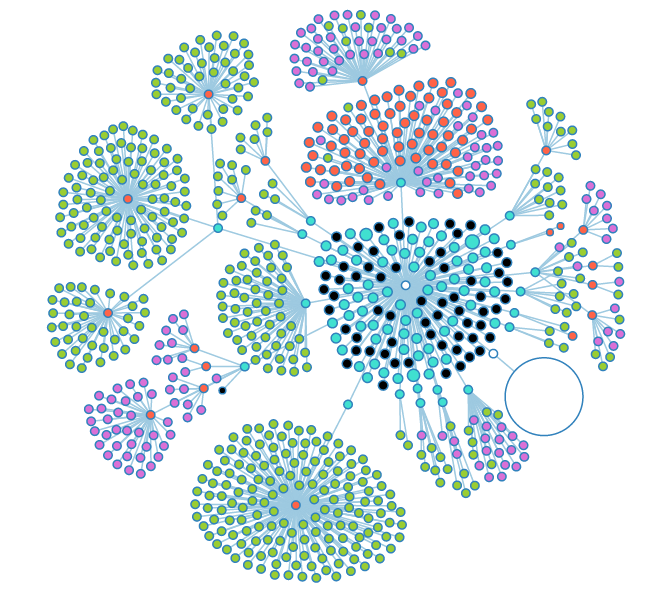 An opened usergroup (teal) reveals a multitude of nested notebooks (red).
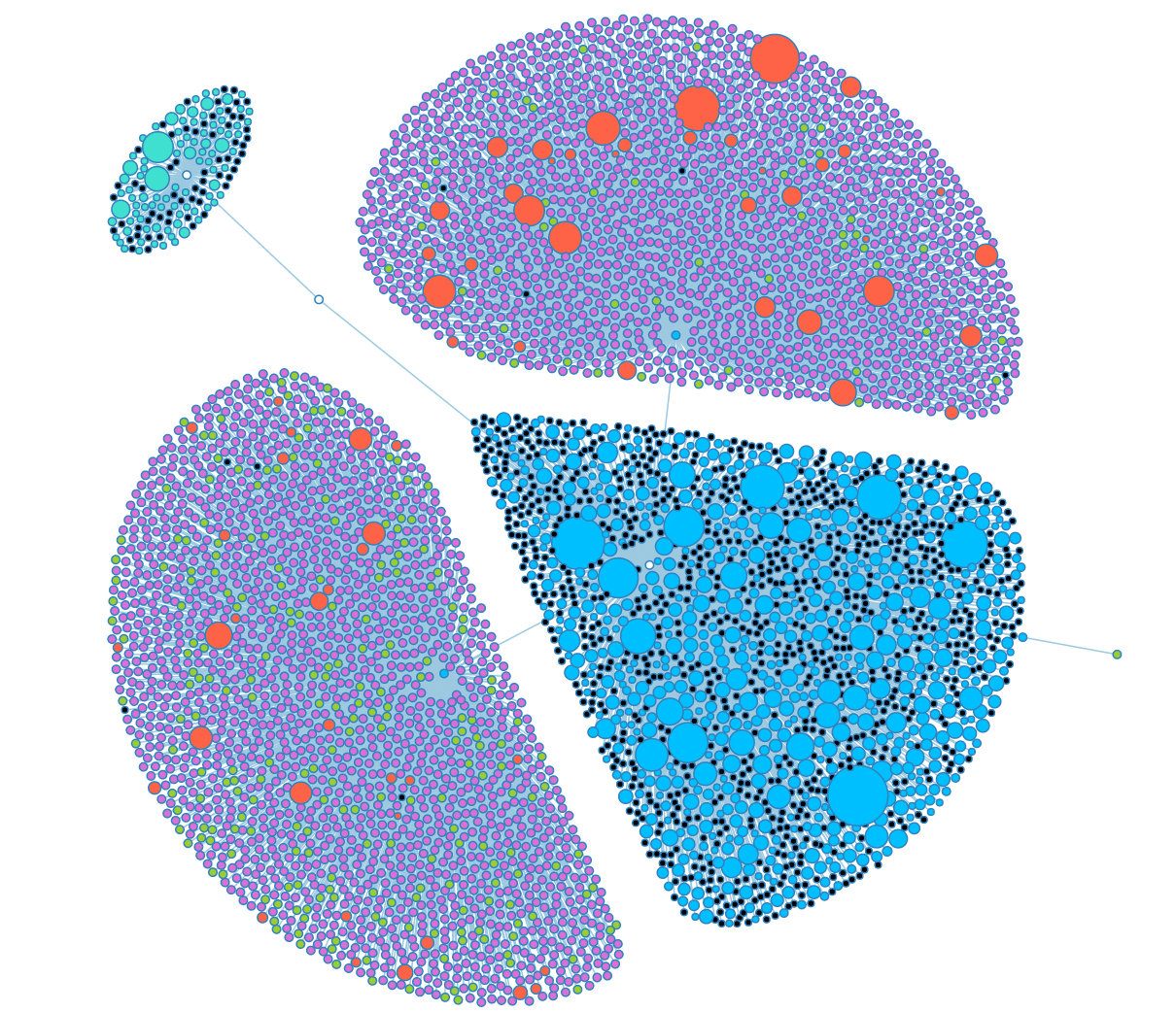 A graph angel that naturally arises when looking at our two biggest power-users.
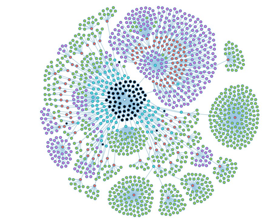 A fully opened look at the group graph. Black nodes are nodes that could have child objects, but don't.
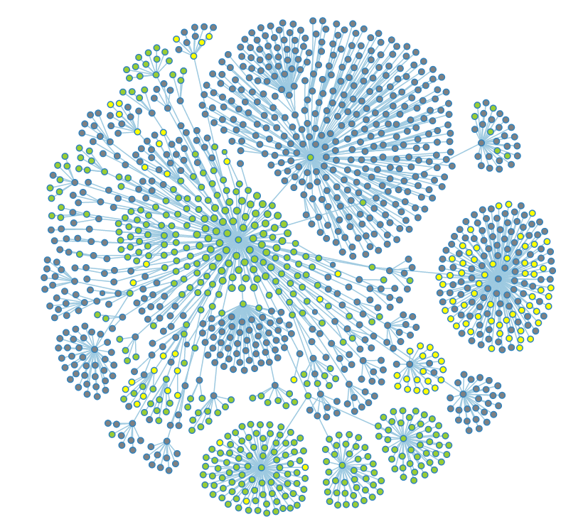 The same graph with a filter applied to show public (green), restricted (grey), and deleted data (yellow).