Data visualization: Difference between revisions
Jump to navigation
Jump to search
No edit summary |
No edit summary |
||
| (One intermediate revision by the same user not shown) | |||
| Line 5: | Line 5: | ||
*the coloration of the data | *the coloration of the data | ||
Here | Here are examples visualization of a codon substitution matrix generated by [[SynSub]] and the refined version. One uses the traditional rainbow of colors, one bases values off of red, yellow and blue. | ||
[[Image:SynSub data visualization | [[Image:SynSub data visualization RYB.png|thumb|1000px|center|Red-Yellow-Blue]] | ||
[[Image:SynSub data visualization | [[Image:SynSub data visualization rainbow.png|thumb|1000px|center|Rainbow]] | ||
[[Image:SynSub arabidopsis lyrata versus thaliana first RYB.png|thumb|1000px|center|Red-Yellow-Blue]] | |||
[[Image:SynSub arabidopsis lyrata versus thaliana rainbow.png|thumb|1000px|center|Rainbow]] | |||
Latest revision as of 19:23, 28 August 2010
One of the major difficulties with genomic data is creating visual representations that enable people to quickly and easily identify patterns. This is a combination of balancing:
- how much data to show
- the detail of the data
- the arrangement of the data
- the coloration of the data
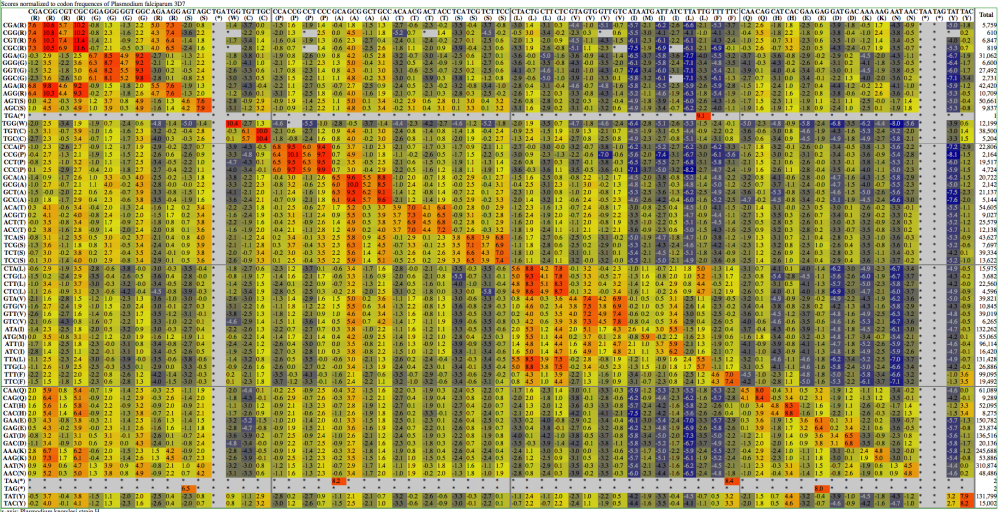
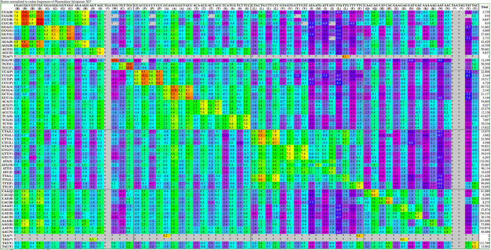
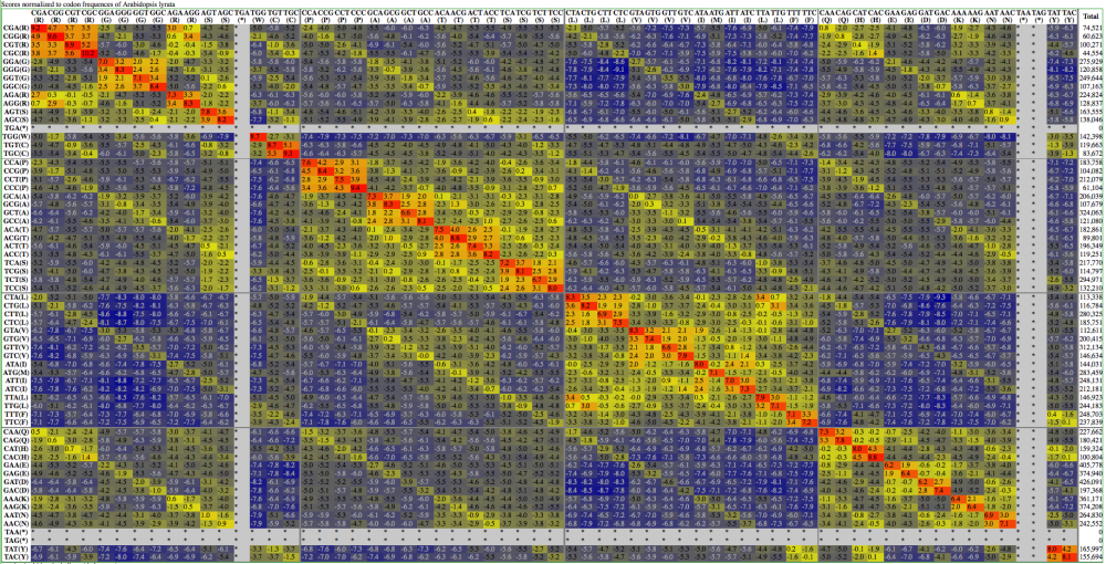
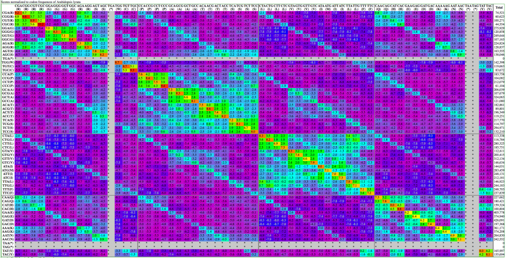
Here are examples visualization of a codon substitution matrix generated by SynSub and the refined version. One uses the traditional rainbow of colors, one bases values off of red, yellow and blue.


