Data visualization
Jump to navigation
Jump to search
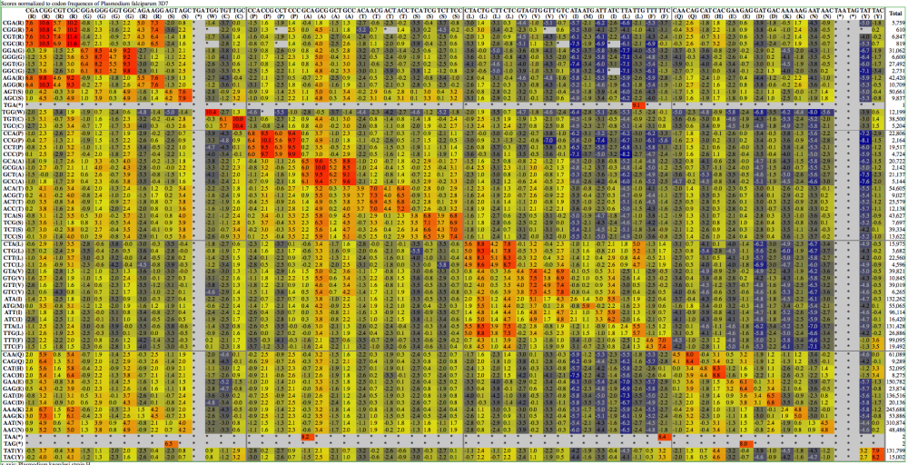
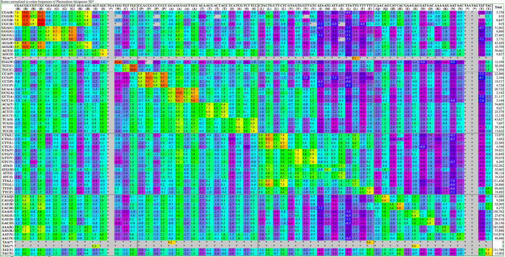
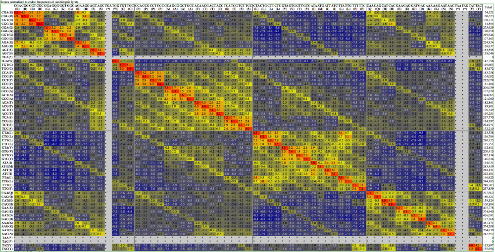
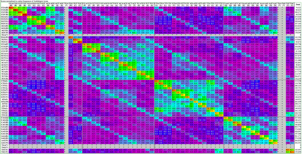
One of the major difficulties with genomic data is creating visual representations that enable people to quickly and easily identify patterns. This is a combination of balancing:
- how much data to show
- the detail of the data
- the arrangement of the data
- the coloration of the data
Here are examples visualization of a codon substitution matrix generated by SynSub and the refined version. One uses the traditional rainbow of colors, one bases values off of red, yellow and blue.


