Difference between revisions of "Chocolate-peach syntenic dotplots"
(Created page with '800px [[Image:Master 8400 10997.CDS-CDS.lastz.dag.go c4 ...') |
(No difference)
|
Revision as of 16:15, 4 February 2011
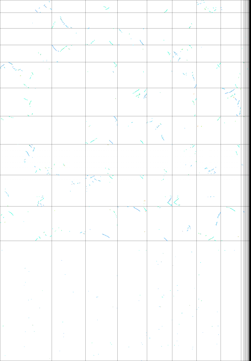
Whole genome comparison using Syntenic doplots between chocolate and peach with evolutionary distances of syntenic gene pairs show by color
The syntenic dotplot shown here is the same as that shown on this page, except this plot uses genes instead of the whole genomic sequence for its analysis. By having gene models, the evolutionary distance between sytnenic gene pairs may be calculated during a SynMap analysis. SynMap uses these values (Synonymous mutations) to generate a histogram, color codes the histogram, and uses those colors for the syntenic gene pair dots. This creates a syntenic dotplot with different colored "lines" showing syntenic regions of different ages. In this dotplot for grape and peach, you will see dark blue and light blue lines. The dark blue lines are for younger pairs of syntenic regions, and the light blue are for older pairs of syntenic regions. If you look carefully at this dotplot, you'll notice that there for any genomic region, there is one dark blue line and two light blue lines. These are due to the shared genome evolution history of these genomes. They shared a Paleohexaploidy event, and subsequently had a lineage divergence event. The dark blue lines are Orthologous regions derived from the divergence of these lineages, and the light blue lines are Out-paralogous regions derived from their ancient share whole genome triplication event.

