Difference between revisions of "Analysis of variations found in genomes of Escherichia coli strain K12 DH10B and strain B REL606 using SynMap and GEvo analysis"
| Line 27: | Line 27: | ||
When you click on the dotplot, GEvo will display 50000 nucleotides towards the left and right from the anchor position. In order to view genes at a high resolution, use side bars to restrict the region of genome being displayed. This will magnify the region of interest and allows to view minute details. This is particularly helpful when finding direct repeats to account for insertions. Insertions in genome could be from exogenous DNA or it could be the result of transposition or translocation. Let us consider the third break in our dotplot. Run [http://tinyurl.com/yldc83u GEVo analysis]. Notice the thin pink bars at the bottom of inserted genes in REL606. These genes are apparently missing in DH10B at this particular locus. Click on pink bars at the ends of the inserted genes in REL606. You will see that these ends are similar i.e both connect to the same pink bar on the other genome. Notice that the information box that appears with connectors show almost the same percent identity for both ends ~84%. (pic) These are direct repeats. Click on the inserted genes to view their annotations. There is a lac operon and few other metabolic genes. But how can a critical operon be missing from E-coli DH10B? If you go back to our dotplot and align the locator on third break, you will see a fragment of green line right above the break. Position the locator on it and click. GEvo analysis will show that the region of "inserted" genes in REL606 is syntenic to region on a farther locus in DH10B. You will see lac operon and other metabolic genes which are missing in DH10B at third break are present elsewhere on its genome. This is an example of translocation (pic) that may take place by the activity of endonuclease or translocase. (pic) | When you click on the dotplot, GEvo will display 50000 nucleotides towards the left and right from the anchor position. In order to view genes at a high resolution, use side bars to restrict the region of genome being displayed. This will magnify the region of interest and allows to view minute details. This is particularly helpful when finding direct repeats to account for insertions. Insertions in genome could be from exogenous DNA or it could be the result of transposition or translocation. Let us consider the third break in our dotplot. Run [http://tinyurl.com/yldc83u GEVo analysis]. Notice the thin pink bars at the bottom of inserted genes in REL606. These genes are apparently missing in DH10B at this particular locus. Click on pink bars at the ends of the inserted genes in REL606. You will see that these ends are similar i.e both connect to the same pink bar on the other genome. Notice that the information box that appears with connectors show almost the same percent identity for both ends ~84%. (pic) These are direct repeats. Click on the inserted genes to view their annotations. There is a lac operon and few other metabolic genes. But how can a critical operon be missing from E-coli DH10B? If you go back to our dotplot and align the locator on third break, you will see a fragment of green line right above the break. Position the locator on it and click. GEvo analysis will show that the region of "inserted" genes in REL606 is syntenic to region on a farther locus in DH10B. You will see lac operon and other metabolic genes which are missing in DH10B at third break are present elsewhere on its genome. This is an example of translocation (pic) that may take place by the activity of endonuclease or translocase. (pic) | ||
| − | Let us consider the ninth break in the dotplot. Run [http://tinyurl.com/yk9kt7e GEvo Analysis] for this break. Magnify the region from 50k to 10k using side bars. Notice that a number of flagella genes are present in DH10B but are missing in REL606. The presence of direct repeats is not evident yet and we cannot conclude that insertion happened in DH10B. We will BLAST DH10B against itself to see any direct repeats. If it is infact, an insertion then we expect to see small pink bars bordering the DNA region containing these flagella genes in DH10B. Click on "Add sequence" and copy and paste the gene ID of DH10B into "name" box in the third sequence. This option allows us to view multiple sequences at the same time. Adjust the number of sequences on left and right to view syntenic regions on all three sequences (pic) You will see various small color coded blocks beneath the inserted genes in DH10B. Click on the blocks bordering the inserted segment. The individual blocks will interconnect and create a criss cross pattern of transparent wedges. Notice that the information box will show 100% identity between the two. These are direct repeats and evidence for insertion in DH10B. <br> | + | Let us consider the ninth break in the dotplot. Run [http://tinyurl.com/yk9kt7e GEvo Analysis] for this break. Magnify the region from 50k to 10k using side bars. Notice that a number of flagella genes are present in DH10B but are missing in REL606. The presence of direct repeats is not evident yet and we cannot conclude that insertion happened in DH10B. We will BLAST DH10B against itself to see any direct repeats. If it is infact, an insertion then we expect to see small pink bars bordering the DNA region containing these flagella genes in DH10B. Click on "Add sequence" and copy and paste the gene ID of DH10B into "name" box in the third sequence. This option allows us to view multiple sequences at the same time. Adjust the number of sequences on left and right to view syntenic regions on all three sequences (pic) You will see various small color coded blocks beneath the inserted genes in DH10B. Click on the blocks bordering the inserted segment. The individual blocks will interconnect and create a criss cross pattern of transparent wedges. Notice that the information box will show 100% identity between the two. These are direct repeats and evidence for insertion in DH10B. Direct repeats allows us to infer that there was a staggered cut in the DNA of DH10B followed by insertion of linear piece of DNA. The gaps at the ends were repaired and ligated. These repaired an ligated gaps became direct repeats that flank the DNA segment containing flagellar genes. Notice that there is not much support that this is translocation. You can click on several green dots that align with ninth break on our dotplot. These regions are mostly repeats which are syntenic all over the genome and are therefore "noise" in our data. <br> |
<br> | <br> | ||
Revision as of 13:11, 29 October 2009
In this exercise you will compare the genomes of two Escherichia coli strains, K12 DH10B and B REL606, using whole genome syntenic comparison and high-resolution analyses of specific genomic regions. These analyses will use CoGe's tools SynMap and GEvo respectively, and will reveal evolutionary changes between these two genomes that happened after the divergence of their lineages. While the nucleotide sequence of these genomes is identical over large expanses of their genomes, many other types of large-scale genomic change will be discovered including phage insertions, transposon transposition, and genomic insertion, deletion, inversion, and duplication events. The computational tools used to do these analyses can be used for comparing genomes of any organisms.
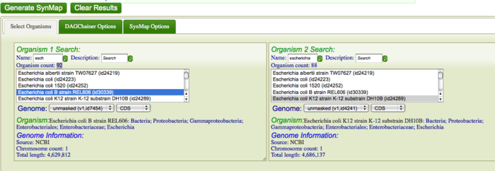
First, you are going to identify syntenic regions between these genomes. Syntenic is defined as two or more genomic regions that share a common ancestry and thus are derived from a common ancestor. To do this, you are going to construct a Syntenic dotplot of K12 DH10B and B REL606 using SynMap. Go to SynMap Search for these E. coli strains in CoGe's database by typing in part of the their names in the "Name" search boxes for Organism 1 and Organism 2. For example, search for "DH10B" and "REL606" respectively, or type "escheri" in both boxes. Once CoGe has found organisms matches these names, make sure they are selected in the Organism List. While there are several parameters that can be configured when generating a syntenic dotplot using SynMap, the default settings work well for most situations, and very well for closely related organisms. Click "Generate SynMap" to start the analysis.
A lot of processing is happening behind the scenes, but the general way a syntenic dotplot is created is the genomes are compared to one another in order to find putative homologous genes between them, and then these pairs of genes are processed to find collinear series of genes in both genomes. The general principle is that the most likely and parsimonious way two genomes have a collinear series of homologous genes is those genomic regions in each organism are derived from a common ancestral genomic region (hence they are syntenic).
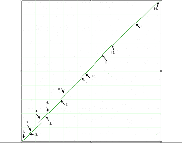
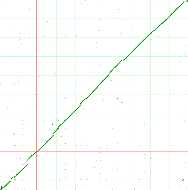
When finished, SynMap will display a dotplot. Each axis of the dotplot is in nucleotide units and represents one of the two genomes laid end to end. The lower-left corner represents the start of each genome (usually 'ORI' for circular bacterial genomes), and the end of each axis is the end of each chromosome. Each putative homologous gene-pair is drawn as a gray dot on the dotplot with its position corresponding to the genomic position of each gene in their respective genomes. Gene-pairs that have been identified has being syntenic are colored green. The collection of these dots appear as green line, which for the comparison of these two genomes, in nearly continuous along the entire length of both genomes.
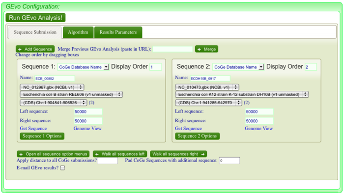
If you look closely at the syntenic dotplot of these genomes, you'll notice that the syntenic line is not perfect, and there are many "breaks" or discontinuities between them. In the figure above, these are indicated by a numbered arrow. These breaks in the syntenic path between these genomes are due to genomic changes happening at a larger scale than a single nucleotide polymorphism, and are mostly likely due to the insertion or deletion of a many nucleotide chunk in one of these genomes. In order to accurately account and characterize these or discontinuities in the dotplot, you need to perform a high-resolution analysis of these regions use GEvo. GEvo allows you to run pairwise comparisons between multiple genomic regions where you can specify how big of a genomic region to analyze. More information on GEvo software tool can be found at: GEvo. To analyse each of these "breaks" in the sytnenic dotplot, first click on the dotplot. This will open a new window with a close-up of the dotplot. When this window appears use the cross-hair locator thar appears when you mouse over the dotplot and place it on the green spot right before a "break". The locator will turn "red" when it is over a gene-pair that can be used as a link to GEvo. When the locator has turned red, click. For example, in order to visualize GEvo analysis of "break" number six, position the locator where the number six arrow points on dotplot. Click when the locator turns "red" or use this address: tinyurl.com/yl4vlbb to regenerate this particular analysis.After positioning the locator and clicking , a new page for GEvo will appear displaying the sequence information corresponding to our region of interest in the dotplot. These sequences are "anchor" points into these two genomes for specifying the genomic regions to be compared. When linking to GEvo, SynMap automatically sets GEvo to specify using 50,000 nucleotides to the left and right of the anchor point. By default, GEvo will use BlastZ for its sequence comparison algorithm, which is a good choice for identifying large blocks of similar sequence. These settings (~100kb of each genome; BlastZ) usually work well for an initial analysis, and all you need to do is click "Run GEvo Analysis!".
Once GEvo analysis appears, we can begin to look for and characterize the differences between these two genomes at this syntenic region. GEvo's results will show two panels, one for each genomic region. The dashed line in the middle of each panel separates the top and bottom strands of DNA. Gene models are drawn as green arrows above and below this line, and clicking on a gene will cause its annotation to appear in a box.
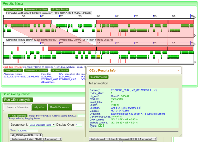
The pink blocks in these panels are genomic regions identified by BlastZ as being similar in sequence composition. If you click on a pink block, a transparent wedge is drawn connecting it to its partner region in the other genome, and information about the blast hit (also known as an HSP) is shown in an information box. Similarly, click on all the pink blocks displayed to connect every region of sequence similarities. Since we are analyzing "breaks" in our dotplot, we expect to see insertion(s) and/or deletion(s) in genomes. These indels will be evident by the pattern of transparent wedges and missing pink blocks.(pic)
Let us look at an example of deletion in DH10B with no apparent changes in the corresponding region of genome in REL606. This corresponds to the GEvo analysis of the first break in our dotplot. You can regenerate the high resolution analysis here [1]. Click on all the pink blocks as to connect every region of sequence similarity. Note that deletion in DH10B creates a gap between the transparent wedges. Click on individual genes in REL606 to identify which genes are missing in DH10B. We can conclude that this is an example of deletion because of presence of pseudogenes at site of deletion in DH10B. Perhaps transposon(s) insertion created pseudogenes that later got deleted. Remember we are looking at these genomes at a single time point and trying to trace back its history. Based on this fact, we can hypothesize that at some point in past, tranposon(s) had integerated into what is now a site of deletion in DH10B. As we will see that transposition is the most common cause of changes introduced in genomes and so it is most likely that this deletion in DH10B was the result of transposon insertion. (pic)
When you click on the dotplot, GEvo will display 50000 nucleotides towards the left and right from the anchor position. In order to view genes at a high resolution, use side bars to restrict the region of genome being displayed. This will magnify the region of interest and allows to view minute details. This is particularly helpful when finding direct repeats to account for insertions. Insertions in genome could be from exogenous DNA or it could be the result of transposition or translocation. Let us consider the third break in our dotplot. Run GEVo analysis. Notice the thin pink bars at the bottom of inserted genes in REL606. These genes are apparently missing in DH10B at this particular locus. Click on pink bars at the ends of the inserted genes in REL606. You will see that these ends are similar i.e both connect to the same pink bar on the other genome. Notice that the information box that appears with connectors show almost the same percent identity for both ends ~84%. (pic) These are direct repeats. Click on the inserted genes to view their annotations. There is a lac operon and few other metabolic genes. But how can a critical operon be missing from E-coli DH10B? If you go back to our dotplot and align the locator on third break, you will see a fragment of green line right above the break. Position the locator on it and click. GEvo analysis will show that the region of "inserted" genes in REL606 is syntenic to region on a farther locus in DH10B. You will see lac operon and other metabolic genes which are missing in DH10B at third break are present elsewhere on its genome. This is an example of translocation (pic) that may take place by the activity of endonuclease or translocase. (pic)
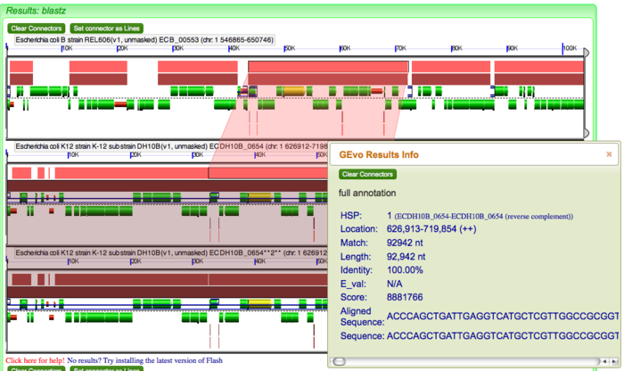
Let us consider the ninth break in the dotplot. Run GEvo Analysis for this break. Magnify the region from 50k to 10k using side bars. Notice that a number of flagella genes are present in DH10B but are missing in REL606. The presence of direct repeats is not evident yet and we cannot conclude that insertion happened in DH10B. We will BLAST DH10B against itself to see any direct repeats. If it is infact, an insertion then we expect to see small pink bars bordering the DNA region containing these flagella genes in DH10B. Click on "Add sequence" and copy and paste the gene ID of DH10B into "name" box in the third sequence. This option allows us to view multiple sequences at the same time. Adjust the number of sequences on left and right to view syntenic regions on all three sequences (pic) You will see various small color coded blocks beneath the inserted genes in DH10B. Click on the blocks bordering the inserted segment. The individual blocks will interconnect and create a criss cross pattern of transparent wedges. Notice that the information box will show 100% identity between the two. These are direct repeats and evidence for insertion in DH10B. Direct repeats allows us to infer that there was a staggered cut in the DNA of DH10B followed by insertion of linear piece of DNA. The gaps at the ends were repaired and ligated. These repaired an ligated gaps became direct repeats that flank the DNA segment containing flagellar genes. Notice that there is not much support that this is translocation. You can click on several green dots that align with ninth break on our dotplot. These regions are mostly repeats which are syntenic all over the genome and are therefore "noise" in our data.
Ambreen: Show the same figure as the previous one but with one of the pink bars clicked on so that it is connected with its partner region.
Ambreen: For the rest of this tutorial: Write sections that:
1. walks the reader through clicking on all the regions of sequence similarity in order to identify that a portion of one genome is missing. Show picture
2. walks through zooming in on a region by adjust the bars in GEvo. Show picture
3. Characterize the genes that are missing in one by clicking on genes (Don't call them green lines!)
4. Determine what kind of event happened.
I want you do carefully choose several examples and walk through them slowly with details so someone who has never seen/done this before can follow:
1. Phage insertion -- evidence: phage genes in new genes
2. Insertion -- evidence: direct terminal repeats; briefly talk about mechanism. Perhaps create another wiki page describing this using figures as we've drawn on the white-board
2. Deletion -- evidence: transposon at position, mechanism: probably due to insertion of two transposons in same orientation and this happens as an insertion, but in reverse
3. Inversion -- evidence: flipped genes.
Ambreen, the rest of this tutorial is confusing. It feels as though you were running out of steam by this point. I find that the best way to write these (or any scientific discourse) is to start with an outline, and then flush out the details (as well as reorganize). Remember, this needs to be of high-quality and not "to get the task done".
end Eric's comments
Notice the fragments of green line all over the dotplot. These represent translocation events in the E. coli strains we are examining. Place the locator on these and run GEvo to determine which genes were translocated.
Notice the pink bars over the DNA segments. Click on these and it will connect to its syntenic region. A sliding window at the sides of the diagram can be used to magnify a region and enables us to view these genes at a higher resolution. Notice the edges of pink bars connecting syntenic regions. They may run parallel or cross each other. The latter represents an inversion event.
Evidence for deletion and insertions can also be found on these genomes using GEvo. At several instants, you will find that the "breaks" in our dotplot corresponds to transposition. Several deletions and insertion events could be explained by transposon activity in these genomes. The DNA segments can also be aligned against each other. This is particularly helpful when locating regions of direct repeats, inverted repeats and determining percent identities between paralogs and orthologs. To align multiple sequences simultaneously, click "+ Add Sequence", copy and paste the name/ID of the organism in the newly created box for additional sequences. Click "Run GEvo Analysis!". The resulting analysis will be color-coded distantly. Click on color-coded bars to find syntenic regions on each sequences. You can also distinguish the DNA segments containing different GC content relative to other parts of genomes. Under GEvo Configuration, click "Results Parameters" and select "Yes" for "Color wobble codon GC content". Click "Run GEvo Analysis!". The region containing different GC content relative to the rest of genome will be color-coded distantly.
Beware of the of the genes that may not seem syntenic (missing pink bars) at first. It is possible to assume falsely that certain genes are deleted/inserted just because not sufficient area of DNA was considered. To avoid that and locate the potential syntenic regions, change the sequence number on either genomes. Under GEvo Configuration, increase/decrease the number of sequences on left/right. Then click "Run GEvo Analysis!".
Detailed analysis of this syntenic dotplot can be found at Syntenic dotplot
